Jumbly Text
Message from 2022
This post is pretty old! Opinions and technical information in it are almost certainly oudated. Commands and configurations will probably not work. Consider the age of the content before putting any of it into practice.

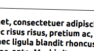
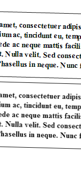
Gross! That slightly rotated text looks terrible!
That text has been rotated the wrong way.

Still wrong.
Rotating Vectorized Text
To rotate vectorized text, use a Rotation matrix on each vertex in the text that hasn’t been rasterized yet. If your rasterizer doesn’t support floating-point coordinates (why would it, you can’t have part of a pixel1), the text will look all jumbly and weird.
Rotating Rasterized Text
Render the text to a grid of pixels called a “surface.” Use a rotation matrix on each pixel in screen space to sample the surface, using some kind of interpolation that isn’t just nearest-neighbor. When you sample a point that’s not completely foreground or completely background, you’ll get a fuzzy-looking intermediate color.

What this means for your designs that have rotated text
Vectorized text is snapped to pixels in Firefox 17.0 on Mac OS X, Chrome 25.0.1364.172 m on Windows, many browsers I didn’t feel like testing, and Photoshop. If this jumbly look is okay or you don’t target these, you don’t really care.
In a web page, you have two ways of rotating text:
      .jumbly {
        transform: rotateZ(1.5deg);
      }

      .smooth {
        transform: rotate3d(0, 0, 1, 1.5deg);
      }
The former, rotateZ, rotates vectorized text. The latter, rotate3d, uses a 3d transform that happens to rasterize the text before rendering it. Since this looks correct in more browsers, use that.

Sources
Source code for the sample pages can be found in the jumbly_text repo on GitHub. I put a demo page up too.
Notes
- Well, sub pixel rendering is a thing, but you can only have three parts of a pixel in that case.